Project Overview
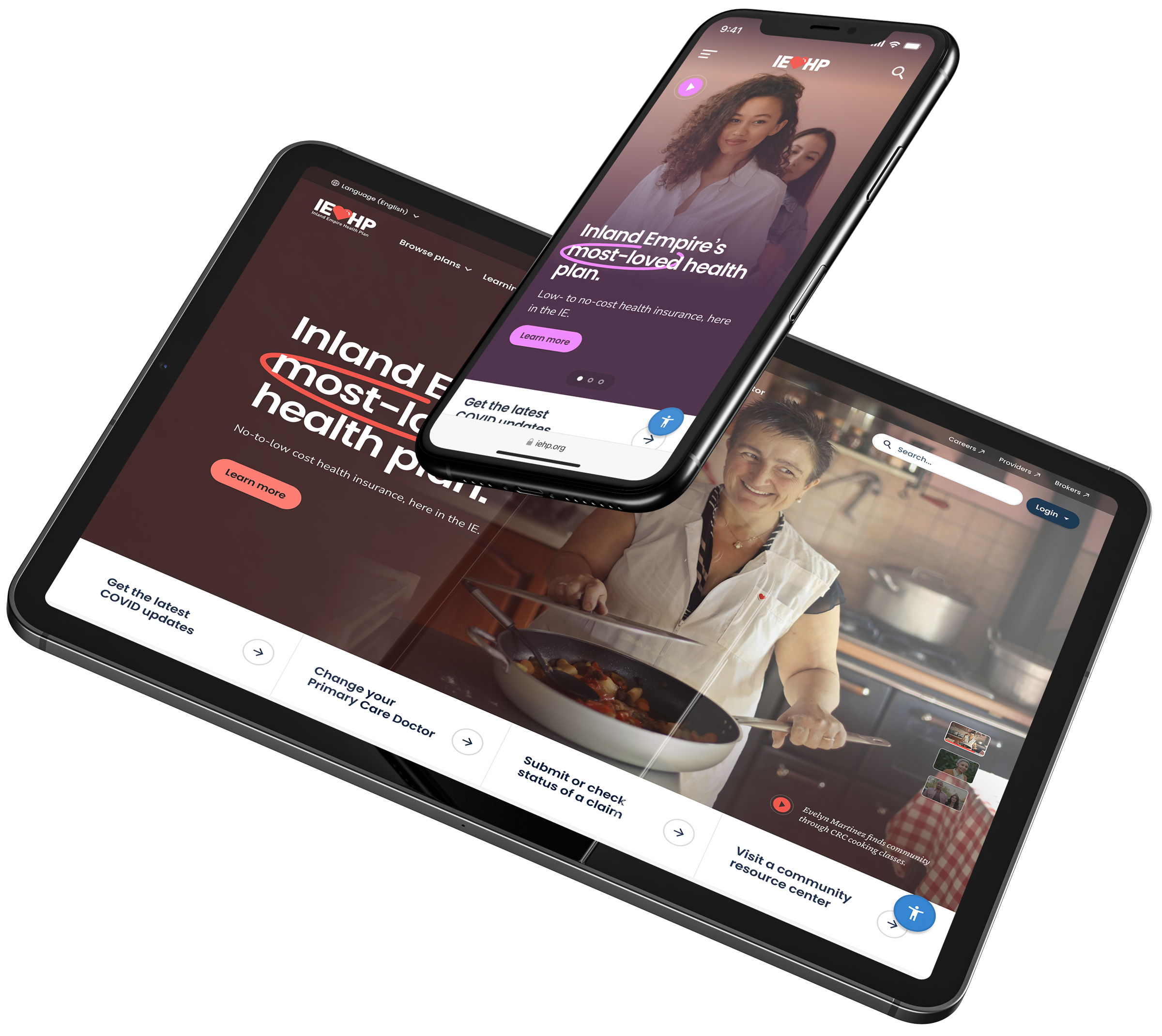
A fresh, new brand and web experience – Inspired by the orgs rich history.
- Design System
- Research
- Revamped IA
- Brand Guidelines
Categories
- Health Care
- Design Systems
- Brand
Client
Year
Oct 2022 – Mar 2023
IEHP is a Medicaid/Medicare program that serves low income Inland Empire residents.
IEHP offers holistic health and preventive care resources by partnering with doctors, hospitals, community centers, and other local groups to ensure members are fully cared for.
High Value Opportunities
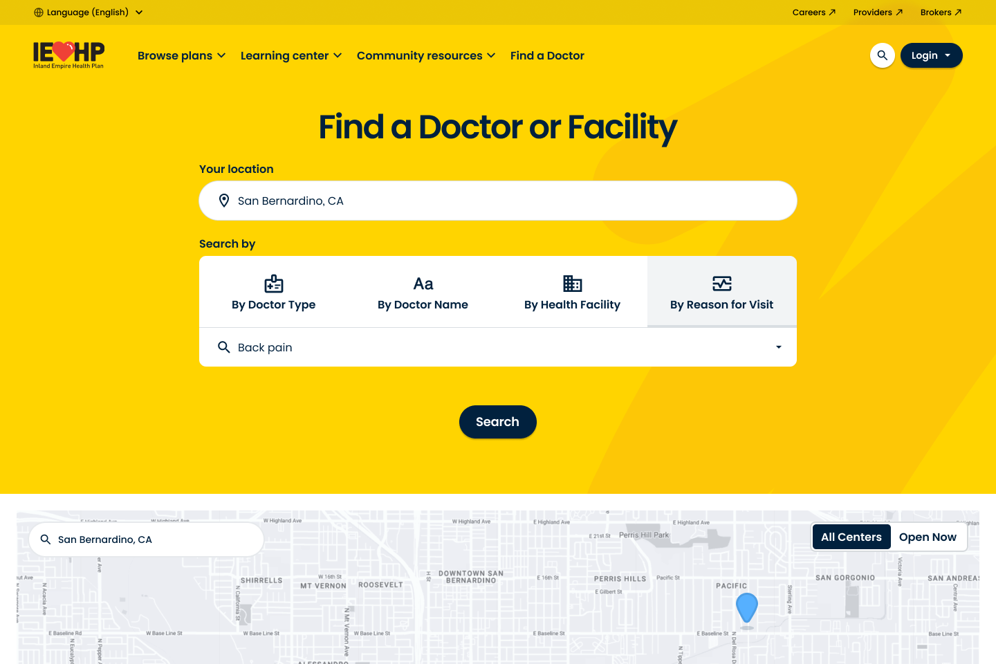
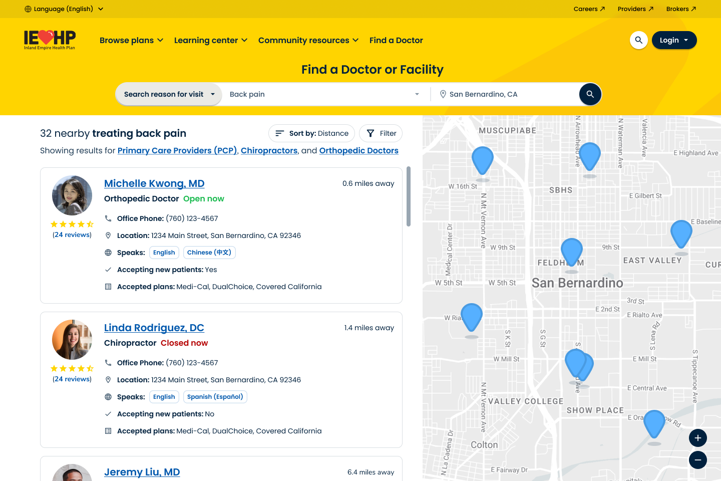
Improve search experience
Content can be hard to find and search is basically non-existent. We had an opportunity to design a delightful search experience that makes finding things easier.
Better mobile experience
The IEHP mobile experience isn’t optimized for mobile or SEO. Would like an experience that prioritizes mobile and makes finding things quick and easy.
Personalization & Localization
IEHP wants Inland Empire residents to see themselves and their region reflected in the site. We have an opportunity to use original content, and portray localized elements of the environment.
Better navigation & wayfinding
The Experience is difficult to navigate and nobody sticks around or explores. IEHP wants to be known for helping people find what they need.
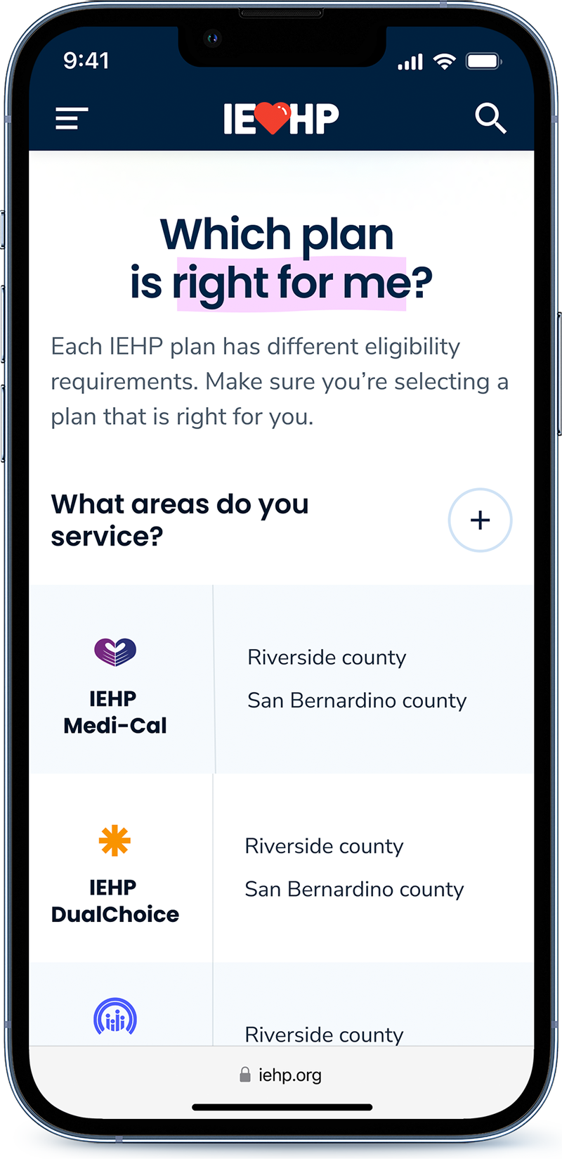
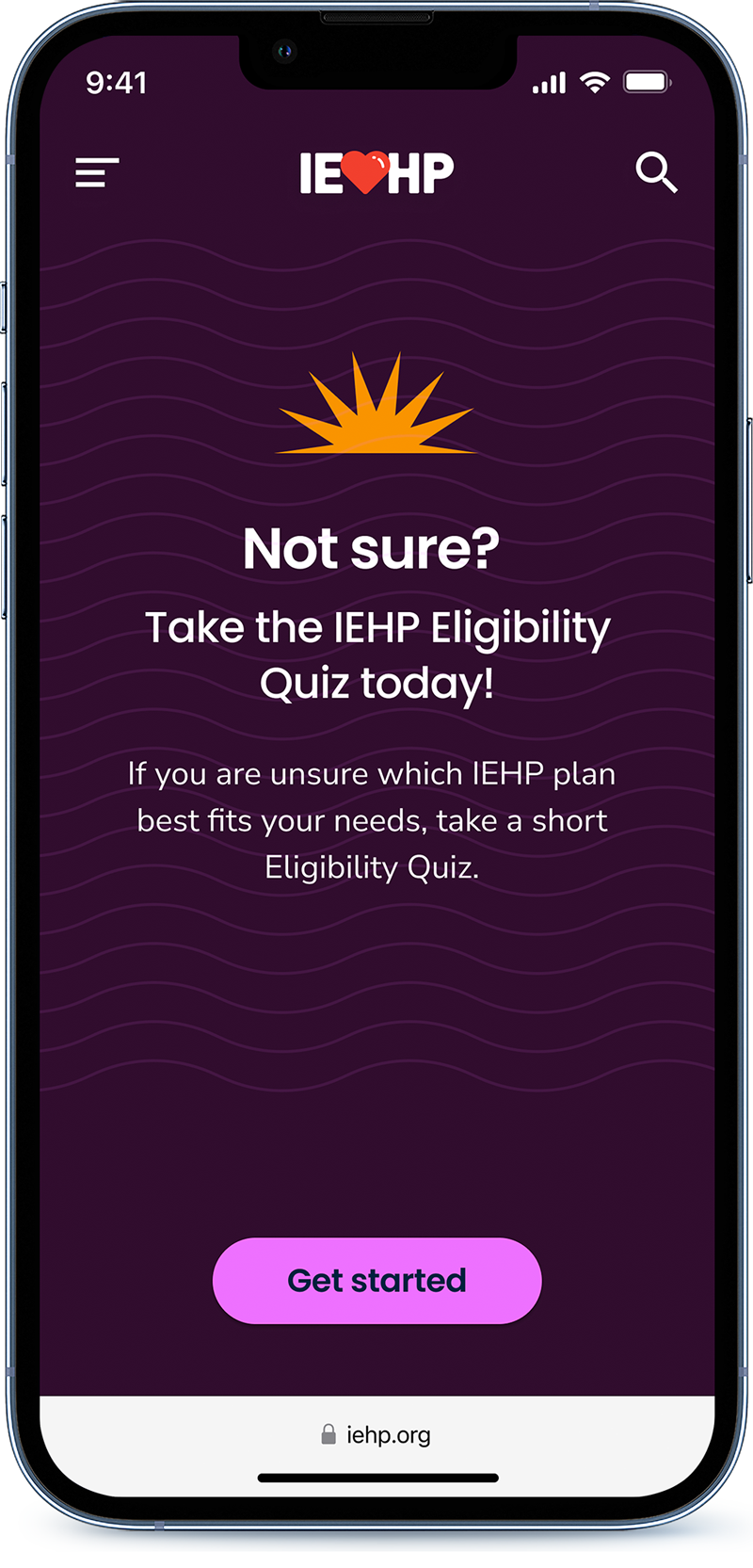
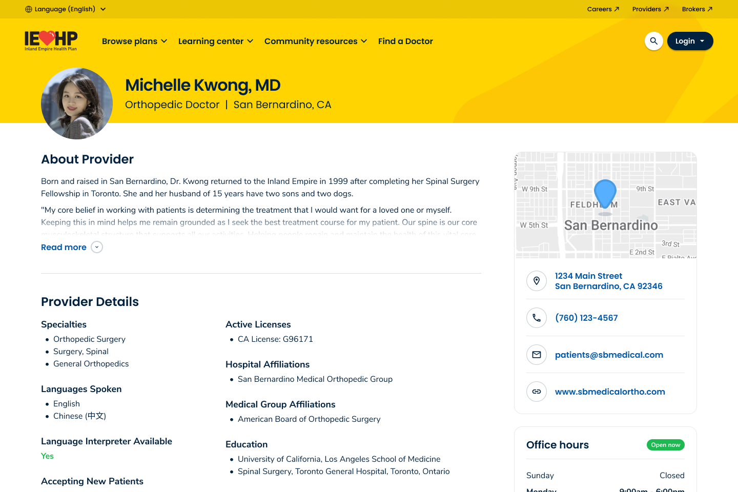
Make complicated things easy
IEHP wants an experience that makes things easy. We want to be known for helping people find what they need and quickly get a sense of what we offer without having to dig too deep.
Accessible content & writing
Opportunity to introduce content strategy that break things down, with dignity since a lot of people are from marginalized and minority backgrounds. We want to provide assurance, trust, and protection.
Authentic imagery
Creating and using original content will help portray a more personal, localized experience while also making the brand feel more authentic and human. We want to use imagery that reflects and celebrates diversity.
Inclusive design opportunities
Inclusivity will be important in designing a functional health care experience. There are strict accessibility requirements and standards IEHP will be required meet. We also want content strategy to be easily understood by all comprehension levels and english language learners.
Discovery & Process
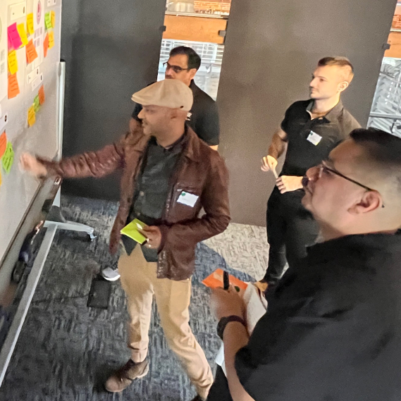
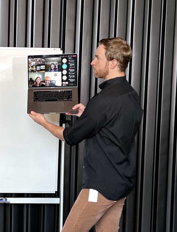
Blink conducted a series of interviews and hosted a strategy workshop meant to align, educate, and collaboratively define product strategy, visual direction, and content strategy.
Stakeholder Interviews
Conducted a series of interviews to define and align on problems and solutions.
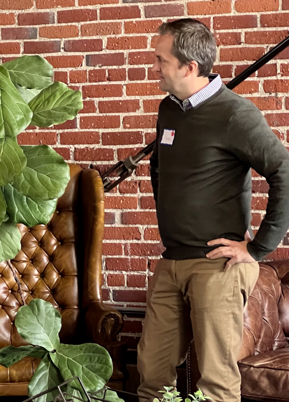
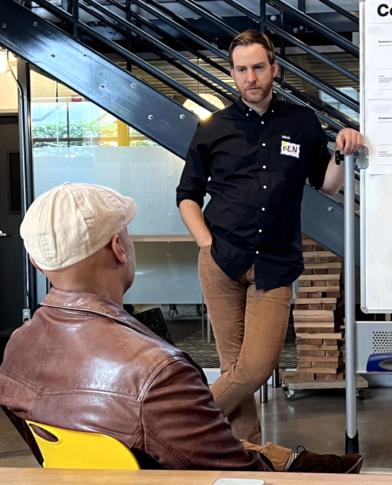
Blink interviewed project stakeholders with the intentions of defining project goals, visions, challenges, fears, knowledge gaps, and more. We synthesized the feedback to make sure we were all aligned to the same vision and understood what was truly important to project success.
Intercept Interviews
Amplified the voices of members and prospects.
We met members and prospects where they’re at and conducted a series of intercept interviews designed to better understand their pain points, motivations, and needs.
Discovery Workshop
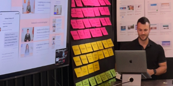
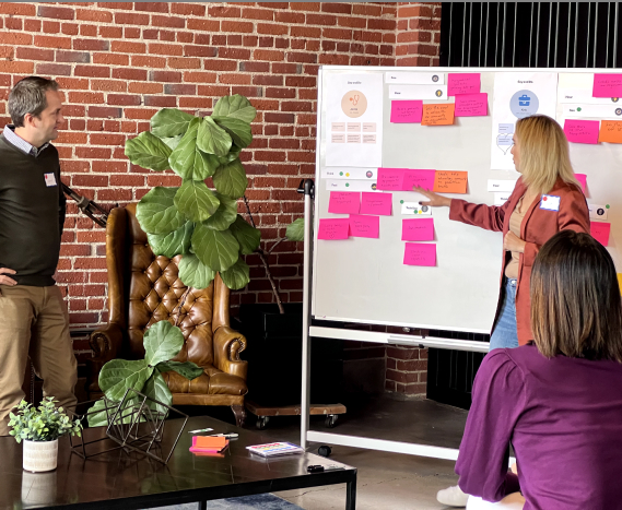
Hosted a 2-day strategy workshop meant to foster alignment and clarity between teams.
Blink hosted a 2 day discovery workshop to align stakeholders, educate our team, and collaboratively define product, content, and visual strategy.
Discovery Workshop
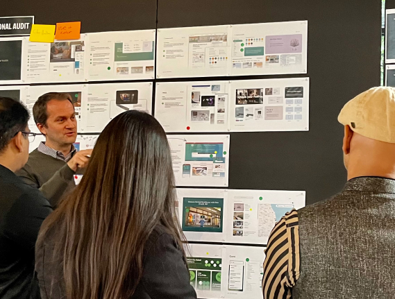
Presented comprehensive audit of brand, website, and analogous experiences.
The Blink team audited IEHP’s website, brand guidelines, competitors, and any inspirational experiences to gain clarity, assess high value opportunities, find areas for improvement, while getting a sense for best practices across industries.
Discovery Workshop
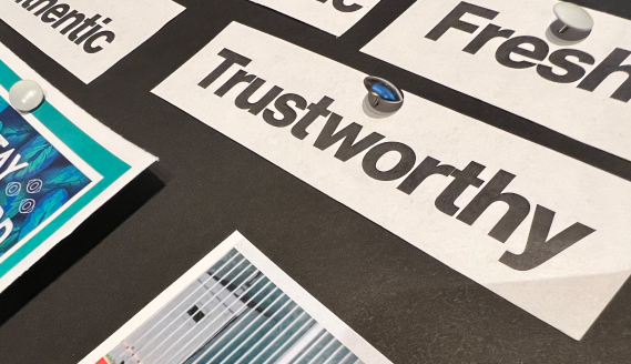
Defined experience continuums
The IEHP team was asked to identify key experience characteristics by ranking various attributes on a spectrum to align on visual direction and strategy.
Discovery Workshop
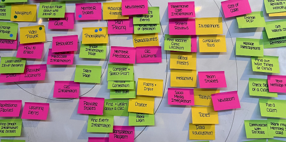
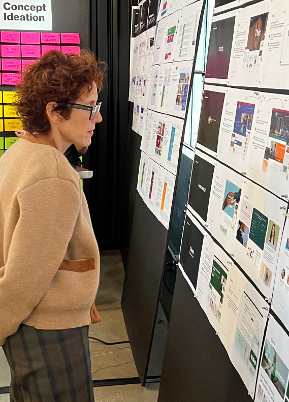
Collaboratively ideated on concepts
After aligning and gaining an understanding of the problem and space, both teams ideated to a set of prompts addressing how we might approach high value opportunities.
Discovery Workshop
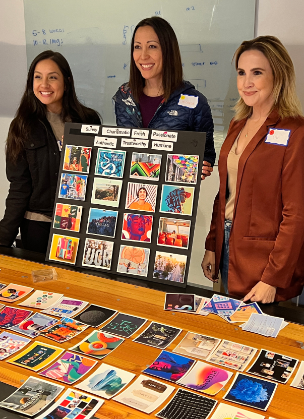
Aligned on visual look and feel
The Blink team curated 400 images of various mixed media and styles. We then asked the team to narrow in on a general look and feel to that will later inform our moodboards.
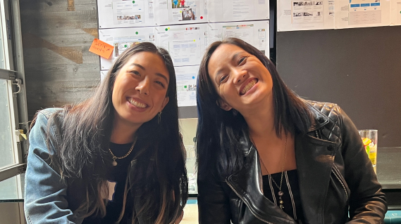
Happy and engaged clients
Our workshop helped set the tone for the rest of the project.
We fostered trust and connection, created opportunities for engagement, and
tied decision making back to workshop findings.
Design Phase
After the workshop we synthesized our findings and moved into the design phase where we define visual direction.
Progressively Informative
The discovery workshop revealed a desire for an experience that surfaces the most necessary information first while still being adequately informative.
Opportunities will be presented throughout the experience to dig deeper or jump to other places for additional information and content. We want to avoid giant walls of text.
Action Oriented
The workshop revealed a desire for an experience that prioritizes guiding the user towards taking action. These actions may be geared towards business objectives or encouraging additional learning.
Playfully Professional
The workshop revealed a desire for an experience that strikes a balance between informal and personal while still maintaining an air of professionalism. We want the experience to feel warm, welcoming, and human.
Telling IEHP’s story and engaging on an emotional level.
IEHP prides itself on being a “healthcare provider with a heart”. Their members are the most important thing to them. It’s crucial that their narrative is weaved throughout the website.
Differentiating from other healthcare providers.
Personalization, localization, and targeted content.
IEHP wanted an experience that felt personal and localized. They wanted their users to see themselves and the area they live in reflected across the site. They also want to utilize technology to make users lives simpler by surfacing the right content given a users location.
Videos and photos over text
Participants who had mid to high levels of technology proficiency preferred to view videos and photos over text to save time when browsing.
Website content is overwhelming
Many participants do not visit IEHP.org at all or perceive the website content to be overwhelming due to information overload.
Access to monthly activity calendar
Participants most often visit the IEHP website in search of the monthly activity calendar, but struggle to find the most up to date information.
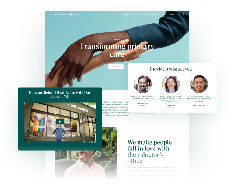
One Medical
Liked diverse imagery, assurances to vulnerable groups, and interactive tools.
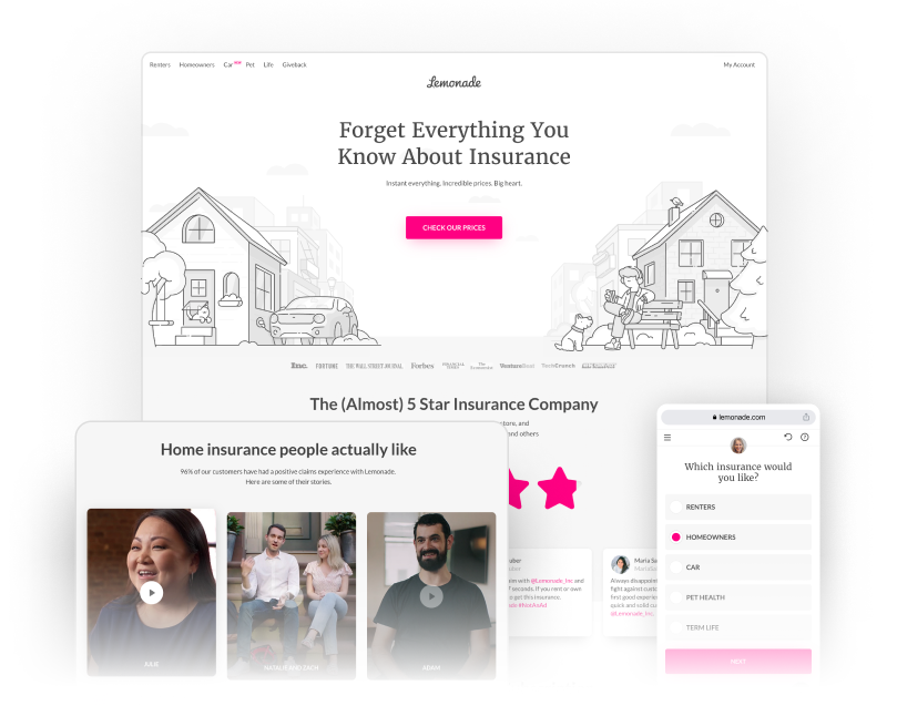
Lemonade
Liked story telling model which features customer stories, social proof, and easy to understand content.
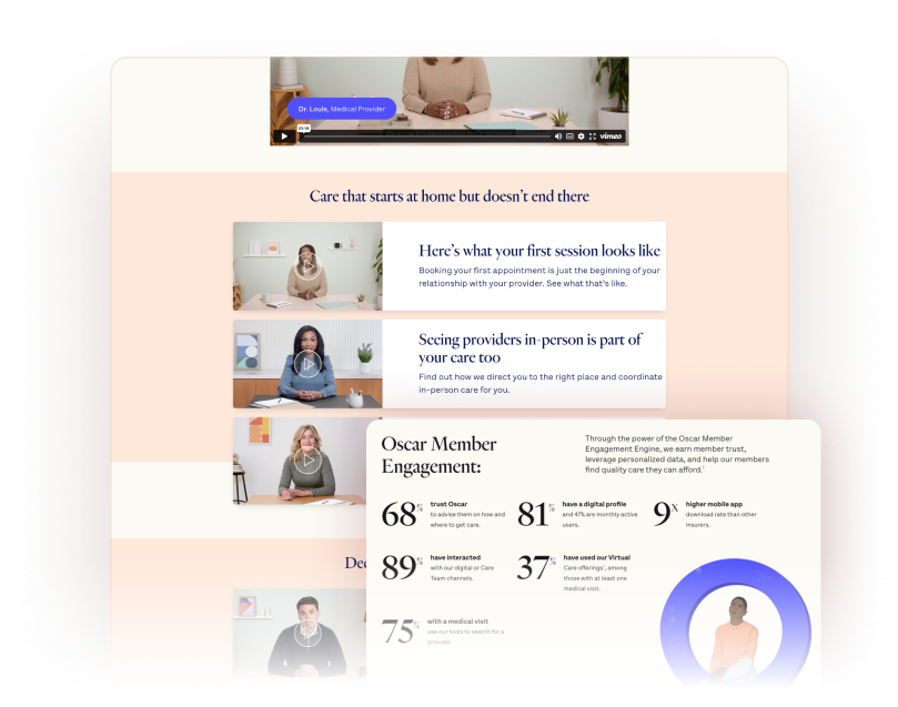
Oscar
Really like how video content is used, prominent facts & figures, and typography usage.
Local Inspiration
We drew inspiration from the region to provide a more personalized experience that felt familiar to residents.
The Work
Home Page
The face of IEHP
We delivered a fresh, modern look by strategically utilizing the IEHP palette in a way that wasn't previously possible.
Making complicated things easy
Navigation & Wayfinding
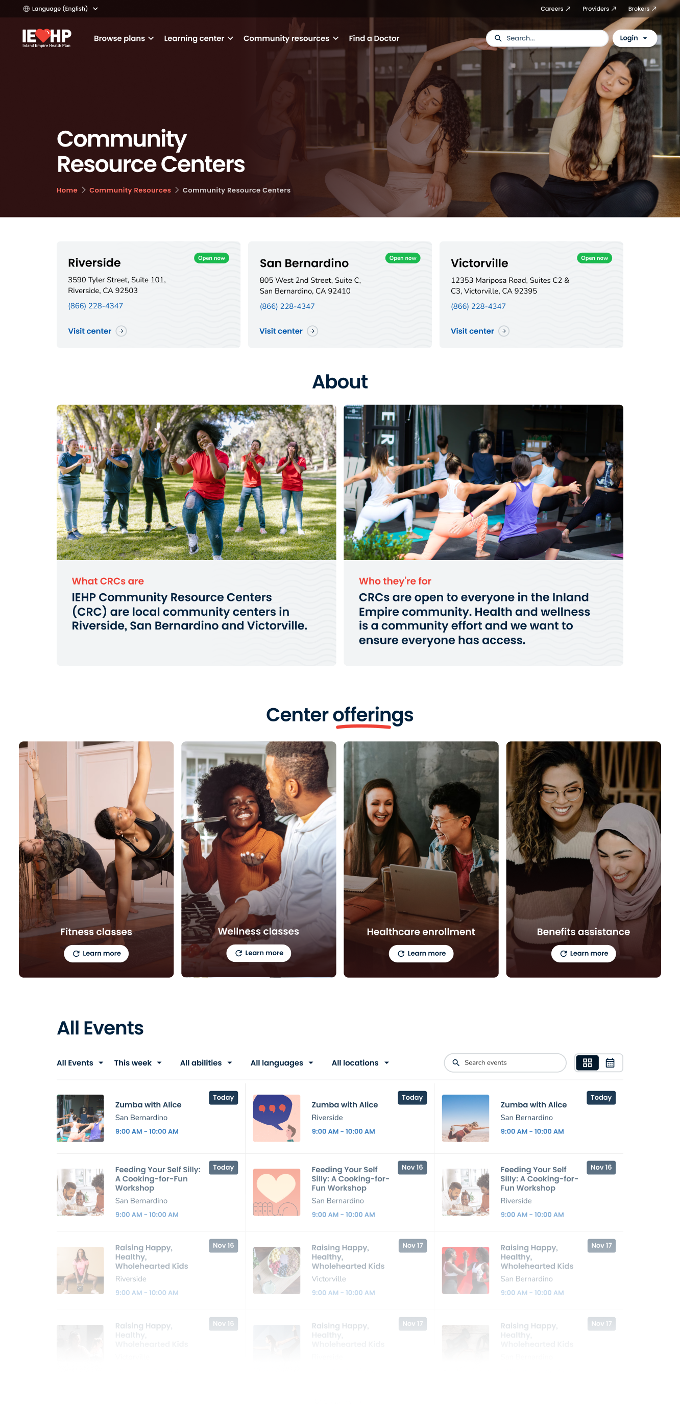
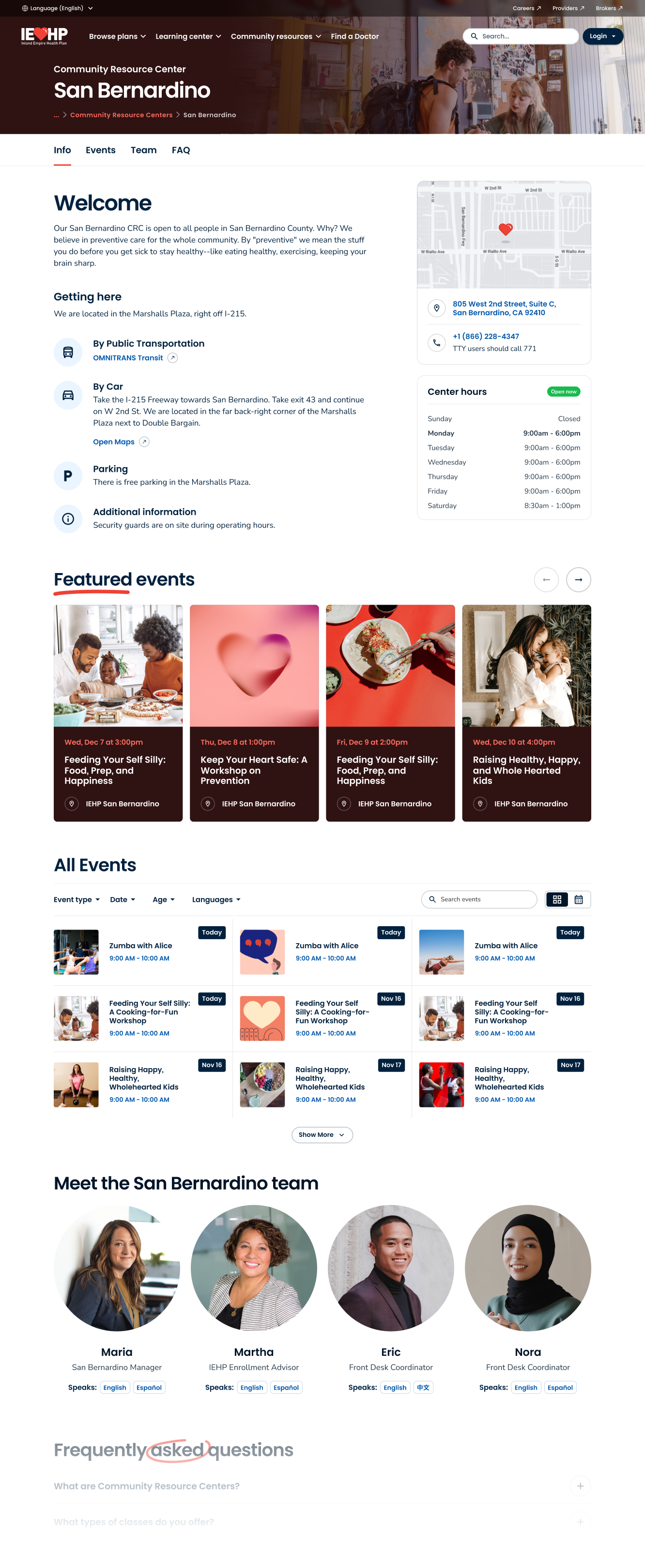
Resource Centers
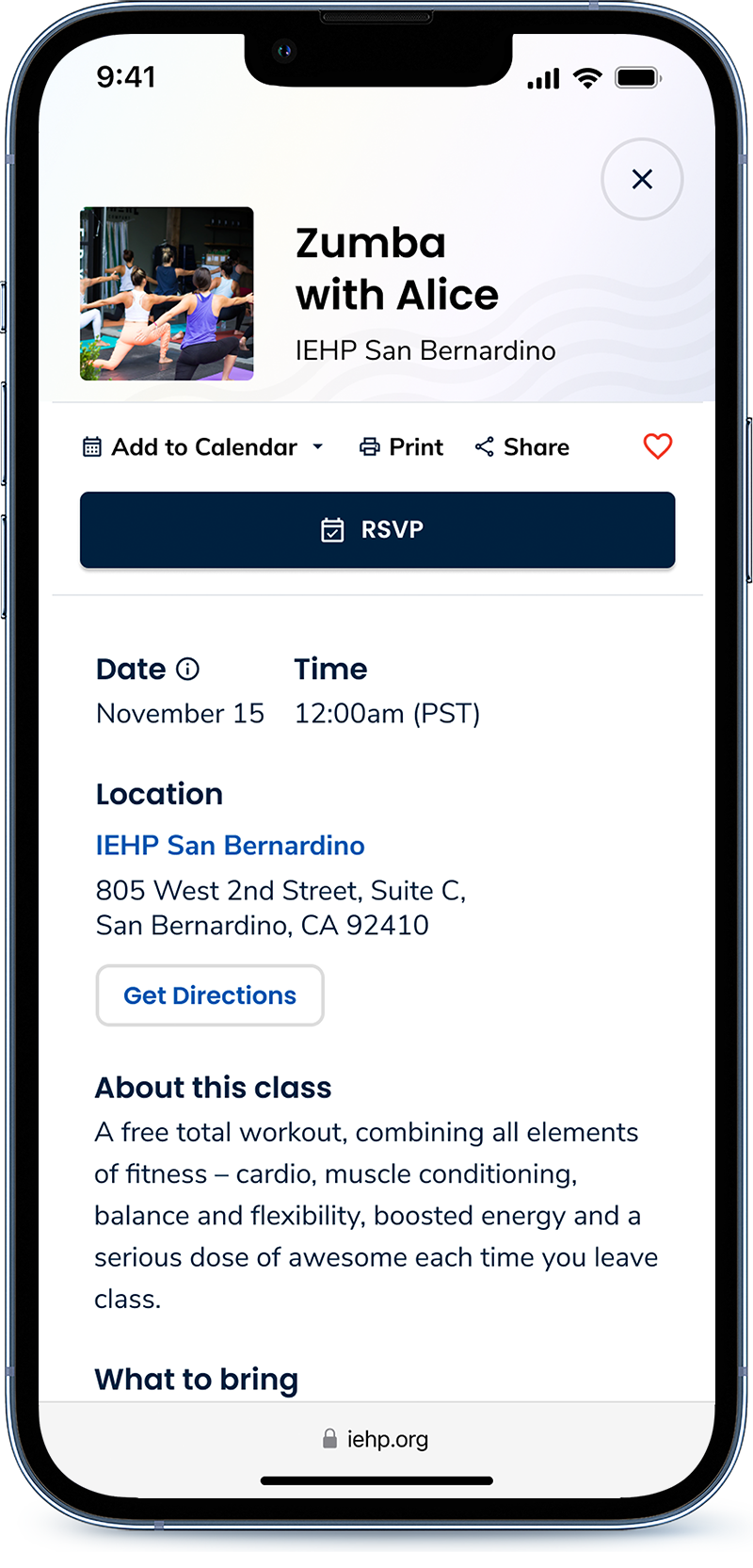
Community & Events
Regardless of membership, IEHP Community Resource Centers are open to the public. They host events, workout classes, resume workshops, and provide resources to help navigate the health care space.
Making complicated things easy
Improved Search
Experience
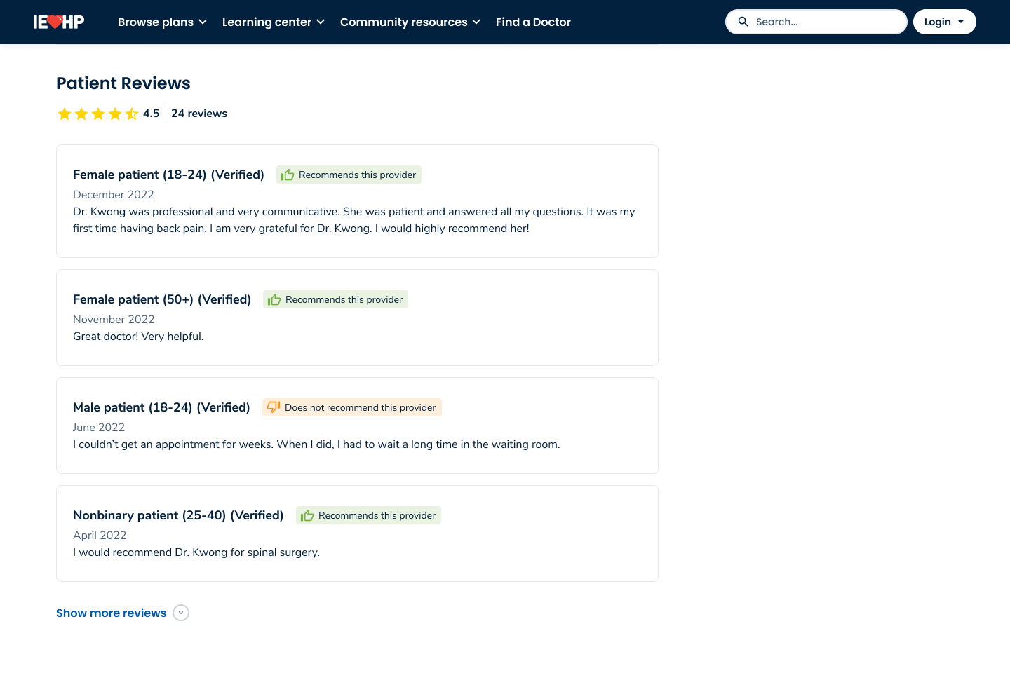
Design System
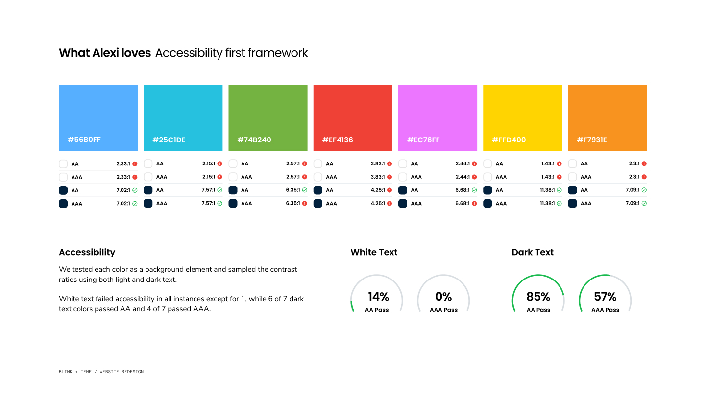
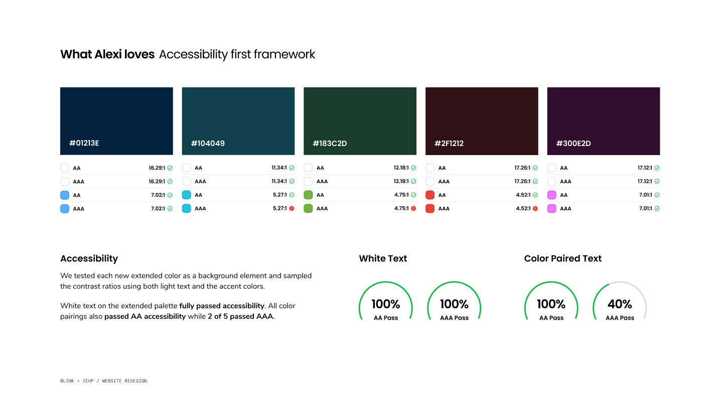
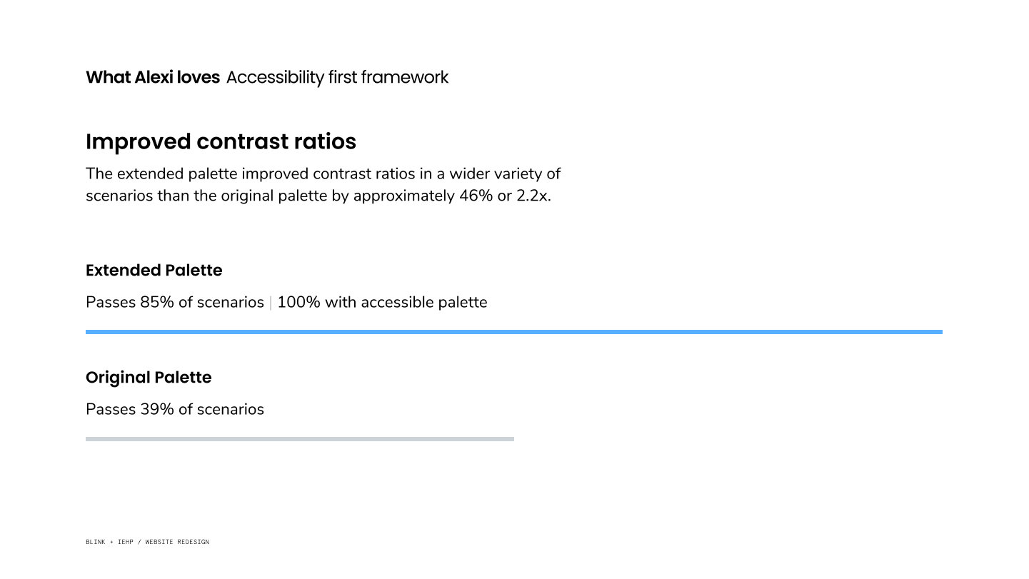
Accessibility first framework
Our commitment to accessibility was present from the start of the project and played a pervasive role in the creation of the IEHP Design system.
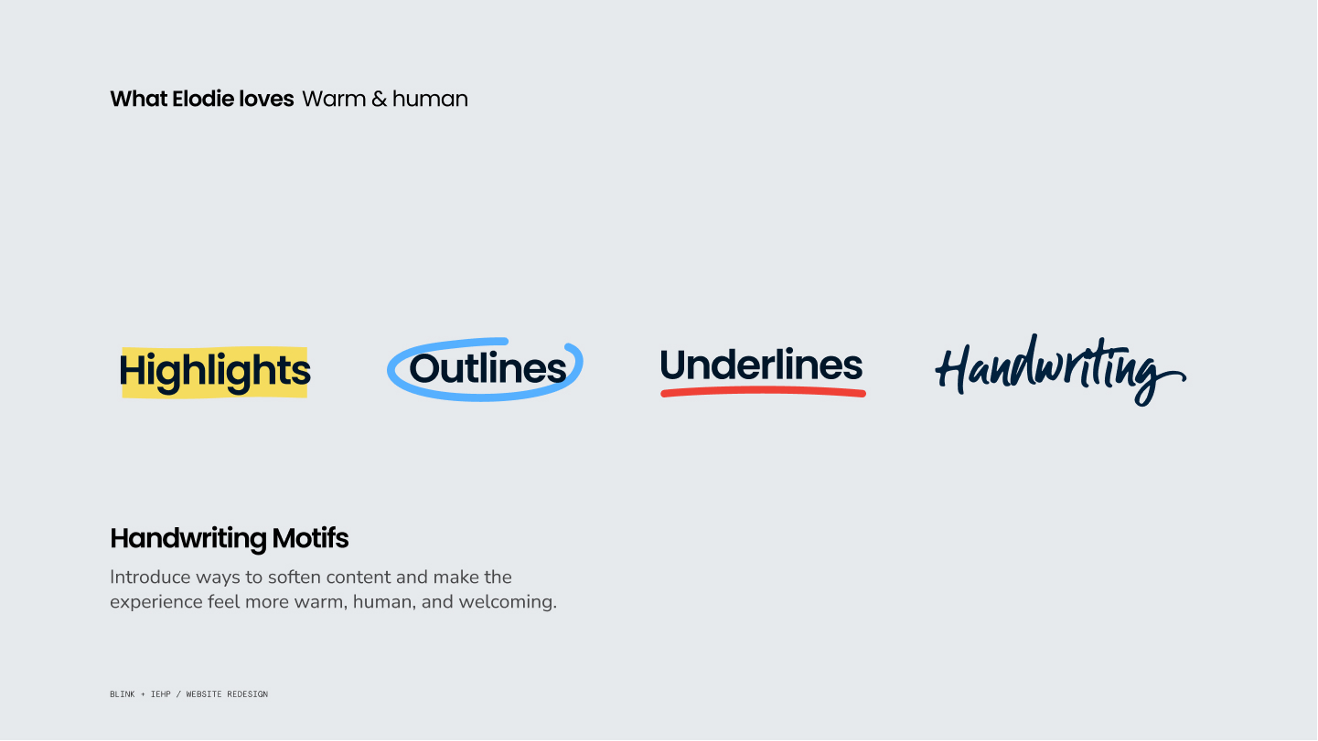
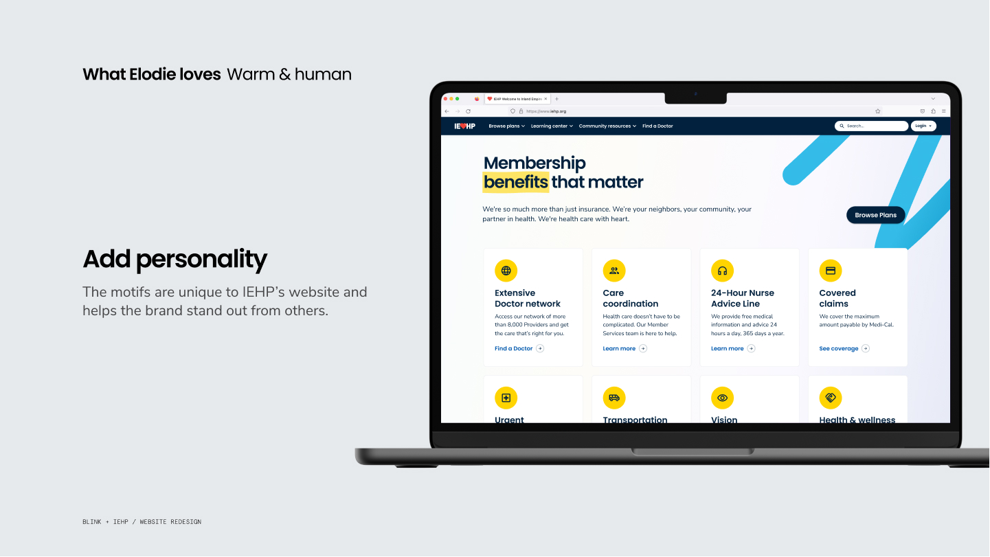
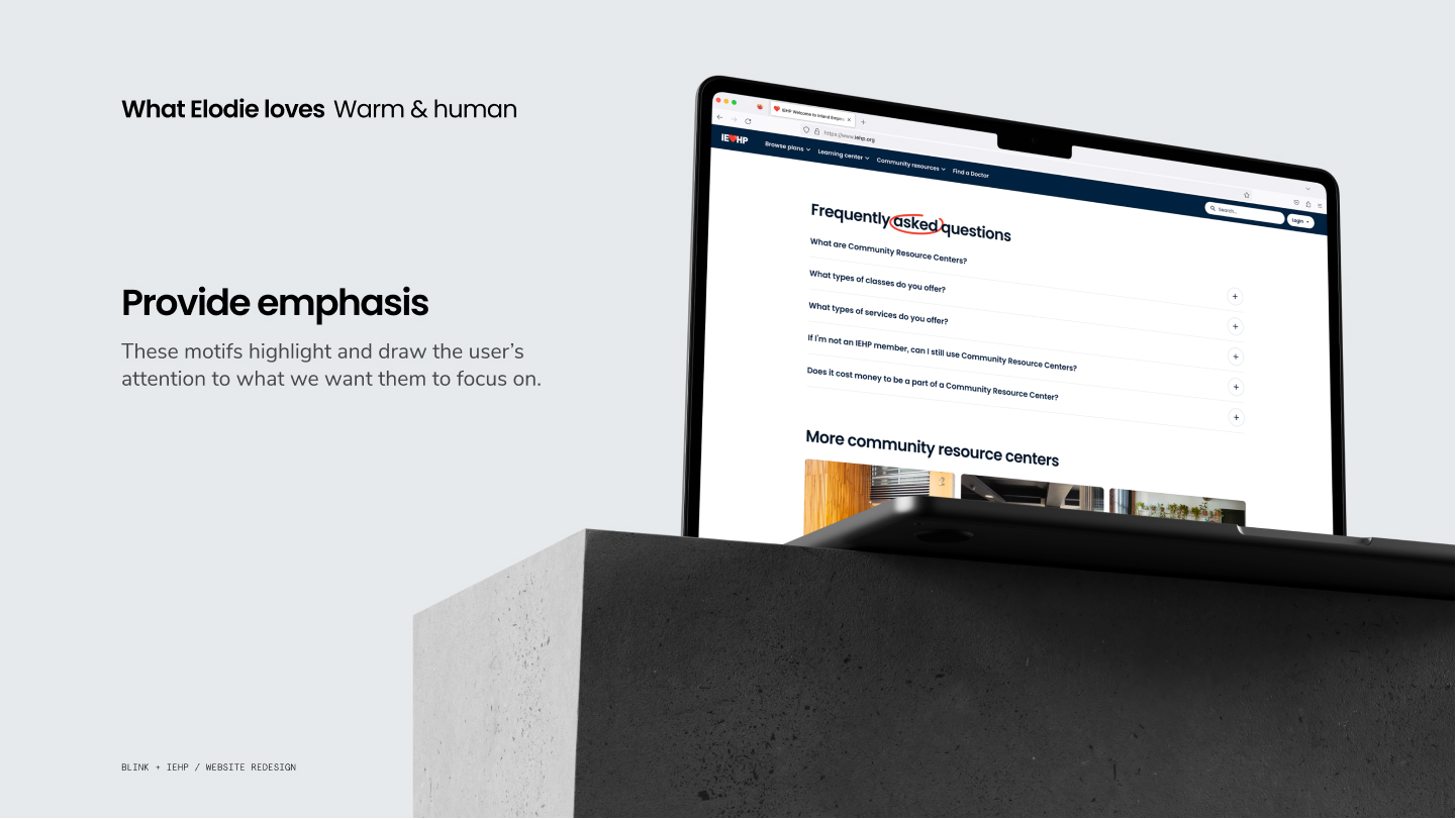
Warm and Human
To give the experience a more organic feel, we introduced a series of design motifs and carefully selected photography meant to provide an element of warmth and humanity.
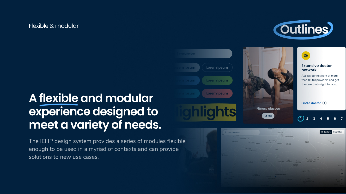
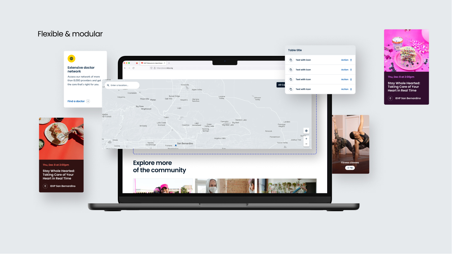
Flexible and Modular
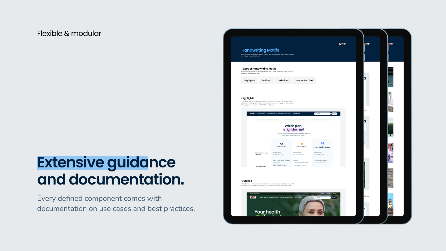
The IEHP design system provides a series of modules flexible enough to be used in a myriad of contexts and can provide solutions to new use cases.
Process Driven Design.
© 2025. andrewdoesdesign. All rights reserved.
